Milk for Our Planet
Brand: Planet Oat
Challenge: Planet Oat needs a fresh new look to highlight how oat milk is a sustainable alternative to cow's milk.
Insight: Remind consumers that oat milk is sustainably made from the planet.
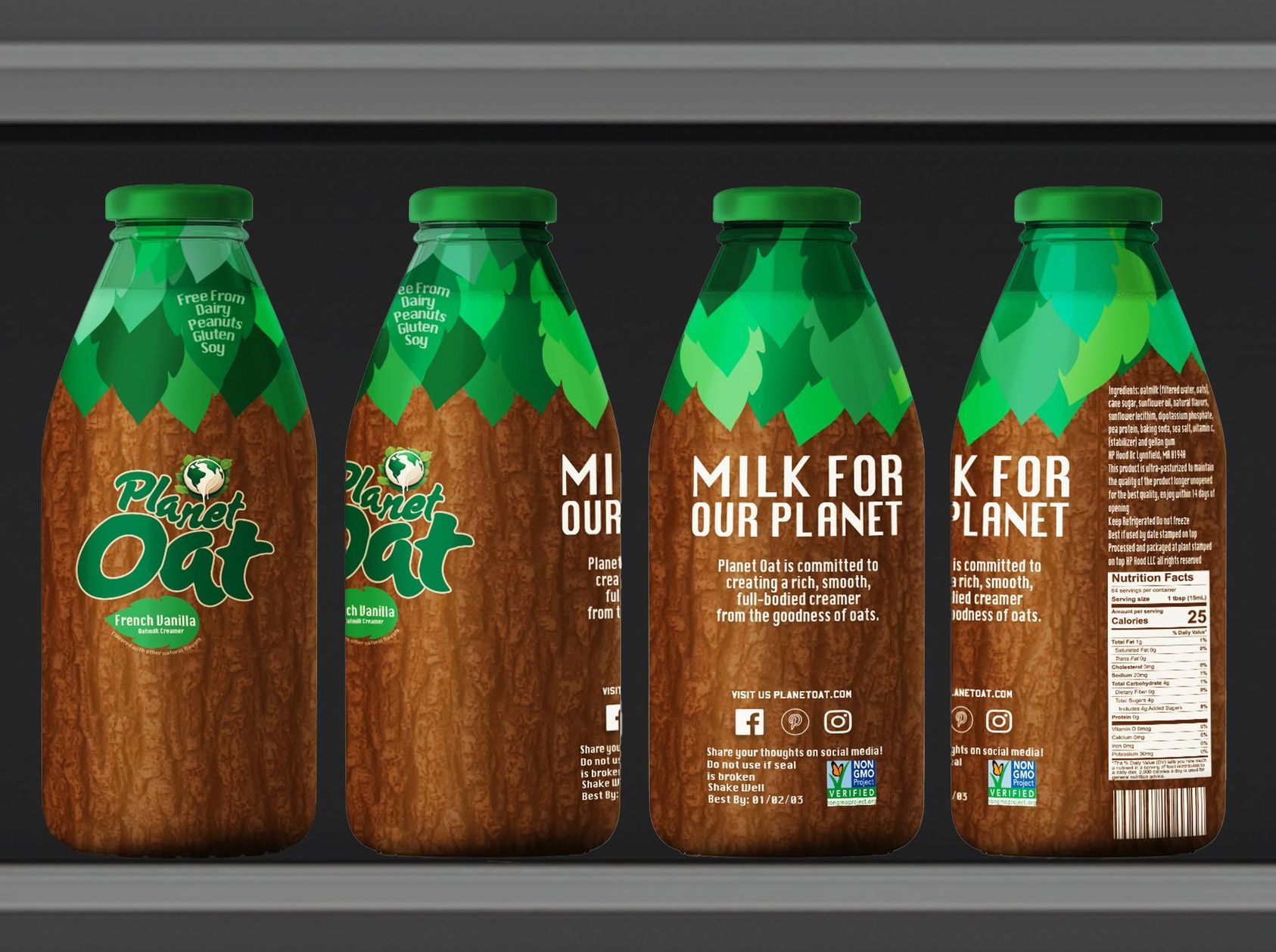
Solution: A visual identity with a neutral color palette, earth icons, and emerald foliage help consumers quickly understand the sustainability of oat milk.
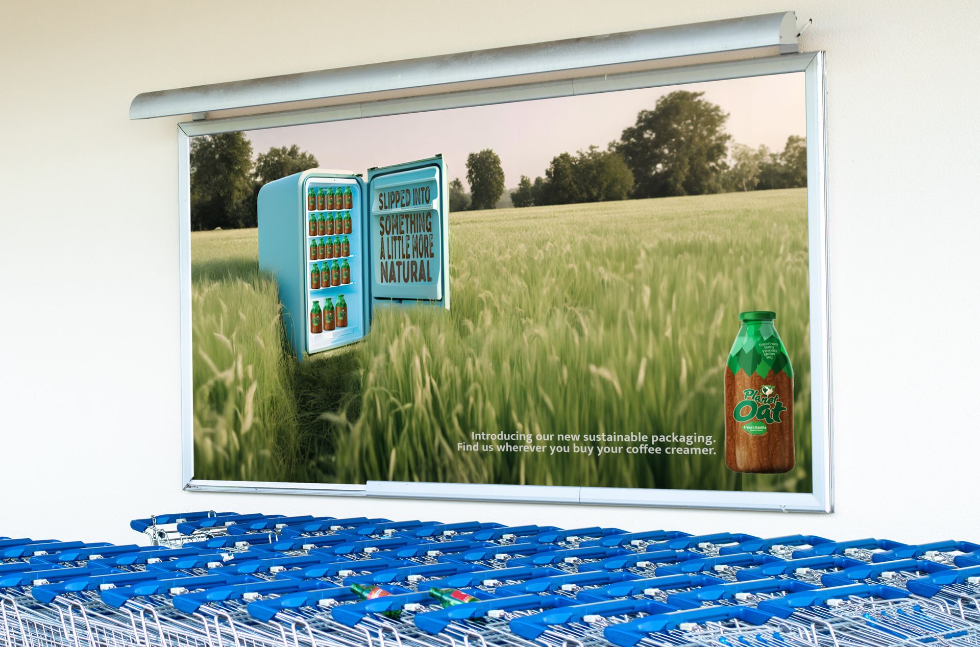
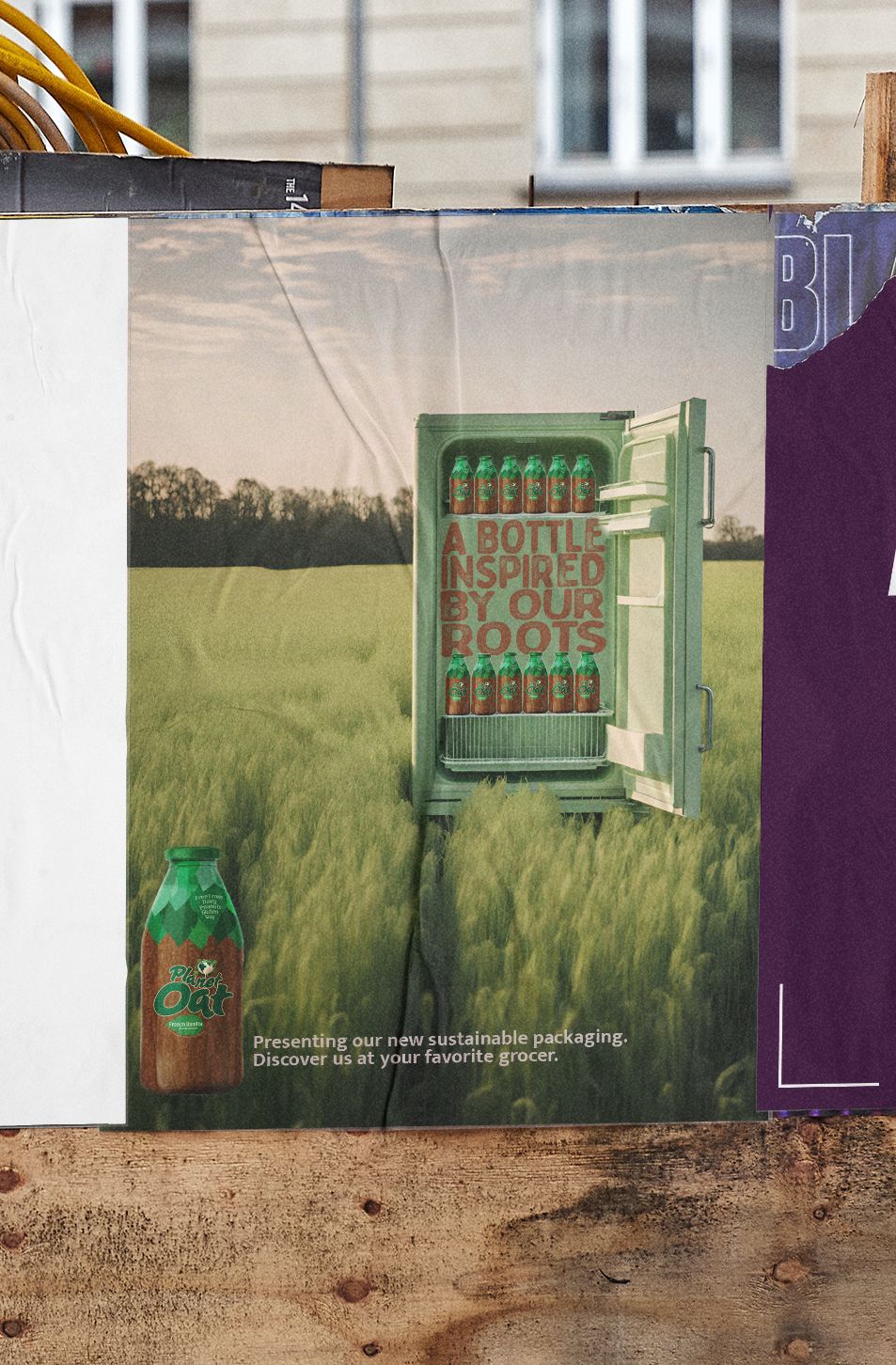
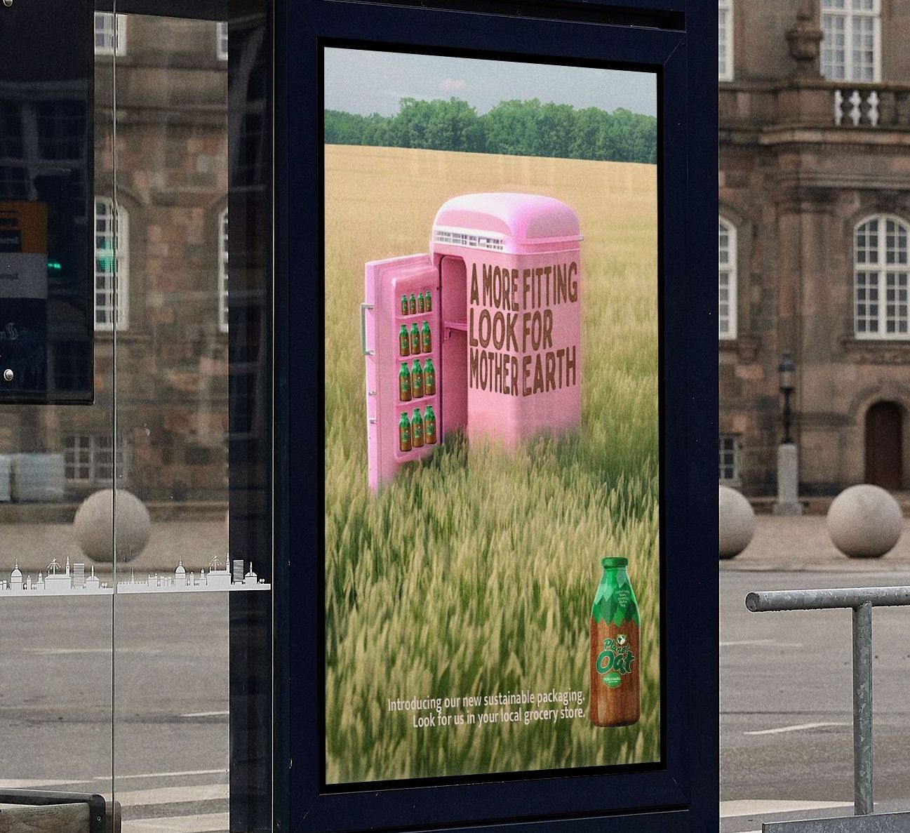
Rebranding to highlight sustainability
New Paragraph
Current Logo
How can I elevate this?
My Design Process
The Best Part
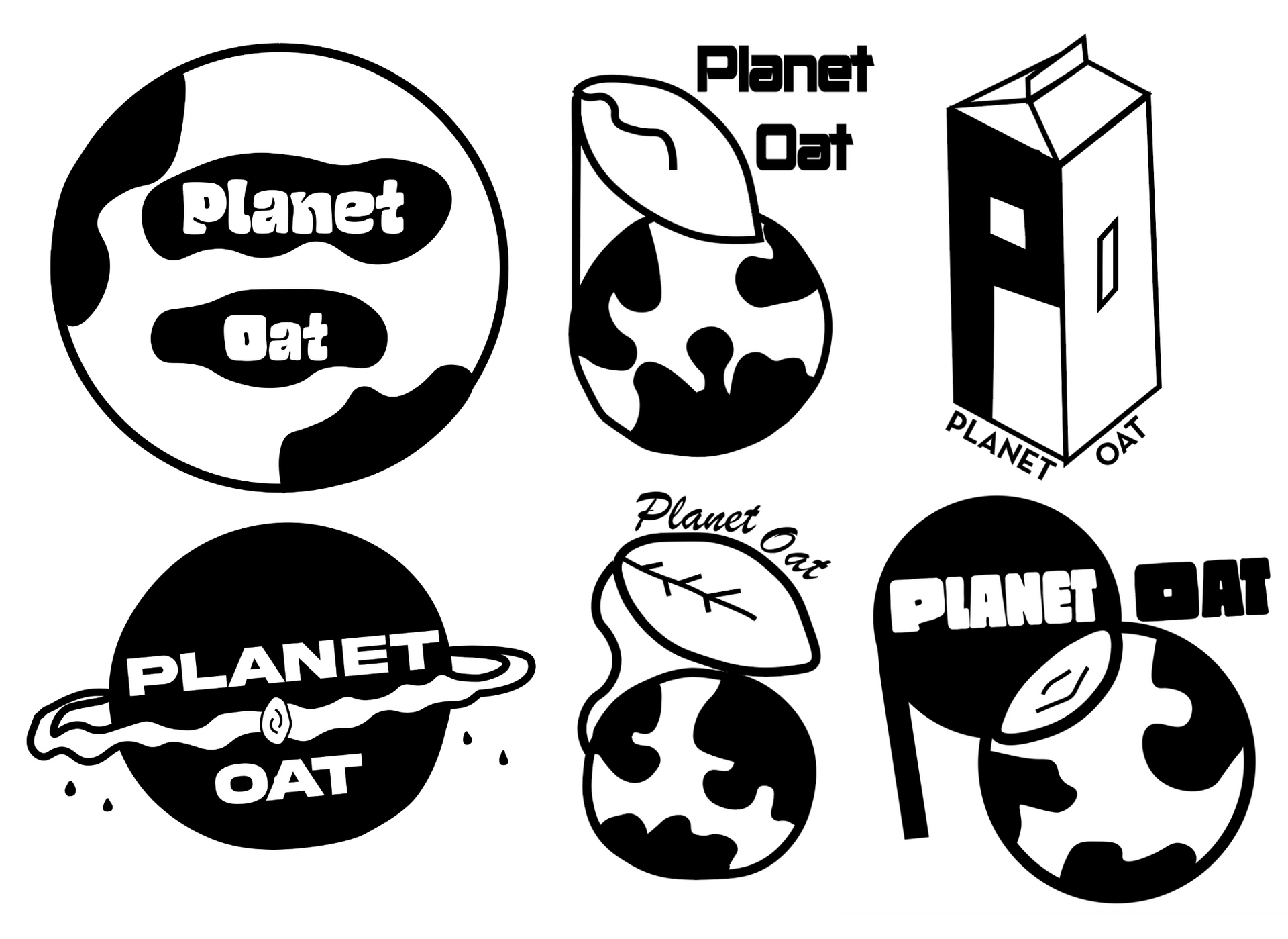
Craft the concept
Globes and drips pair nicely.
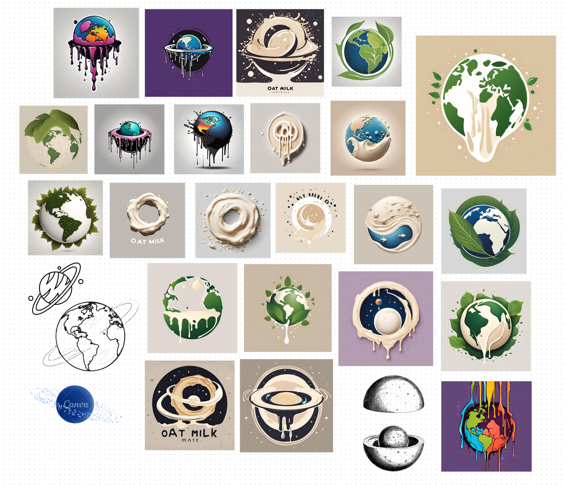
Let my imagination loose on AI
How silly can I get?
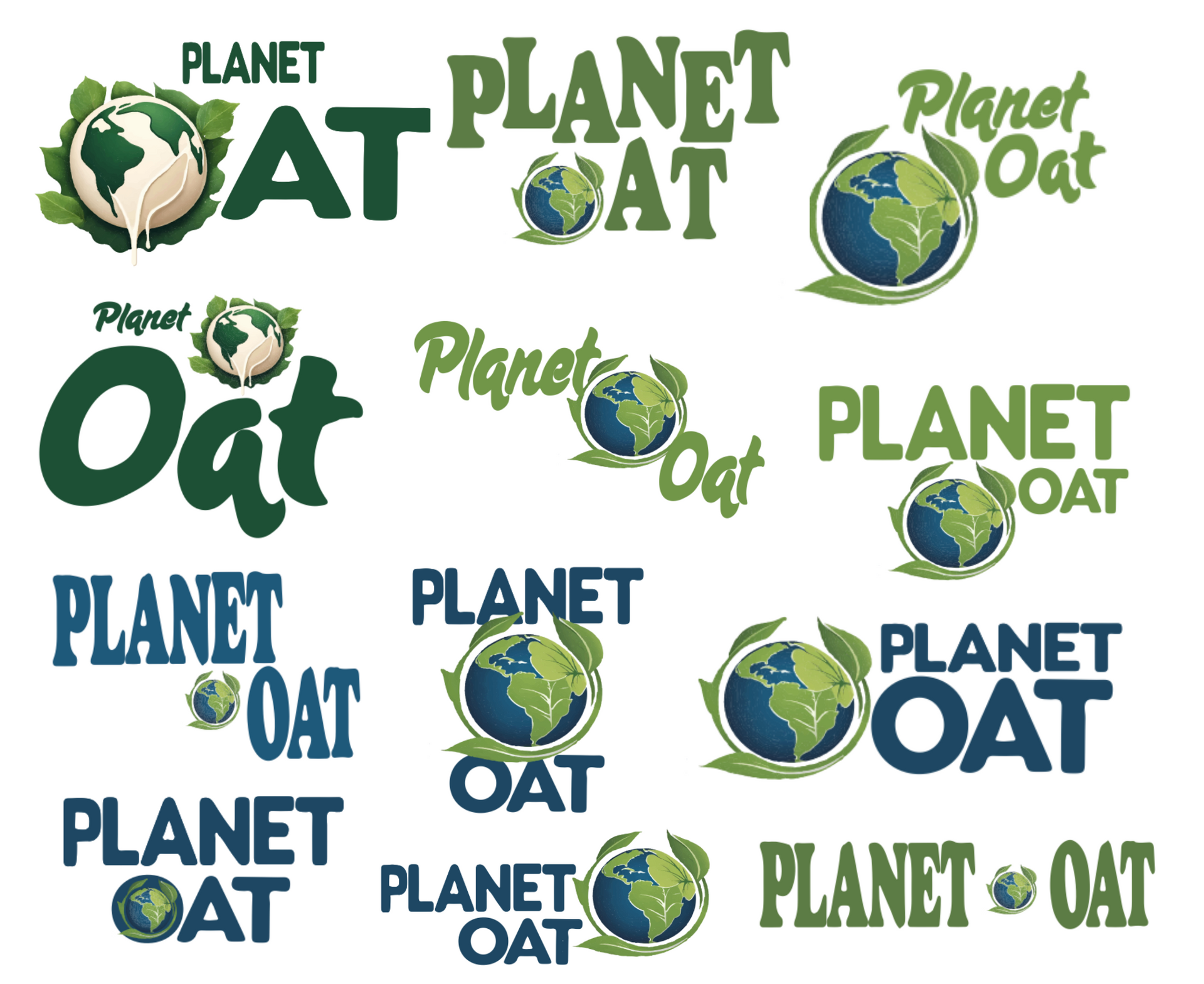
Playing matchmaker
Palpable chemistry is the goal.
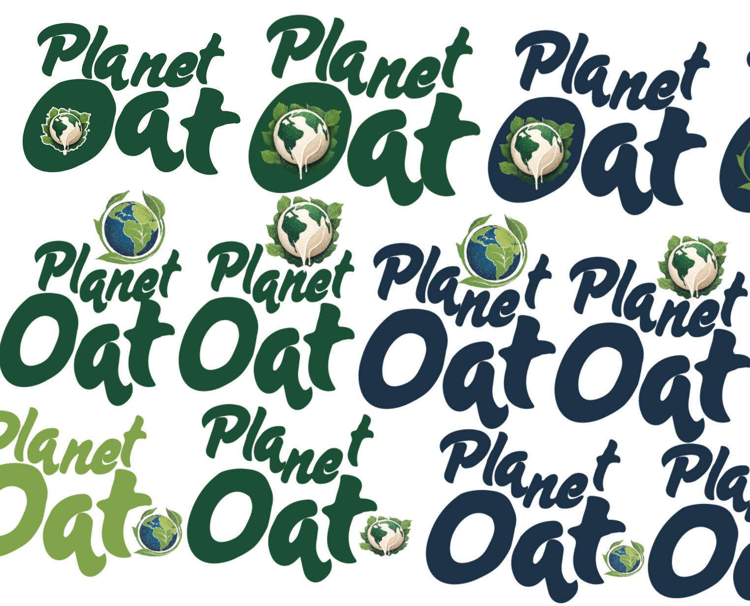
Goldilocks Gone Wild
No satisfaction 'til it's perfect.
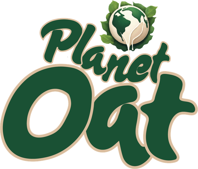
Now I present....
The Final Logo
An organic look for plant-based milk.
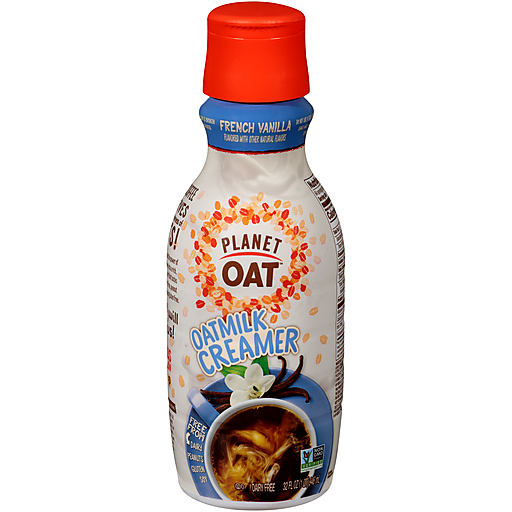
Now for the rest of the bottle.
Current Packaging
How can I make sure consumers immediately understand the sustainability of oat milk?
The thrill of the next idea
My Design Process
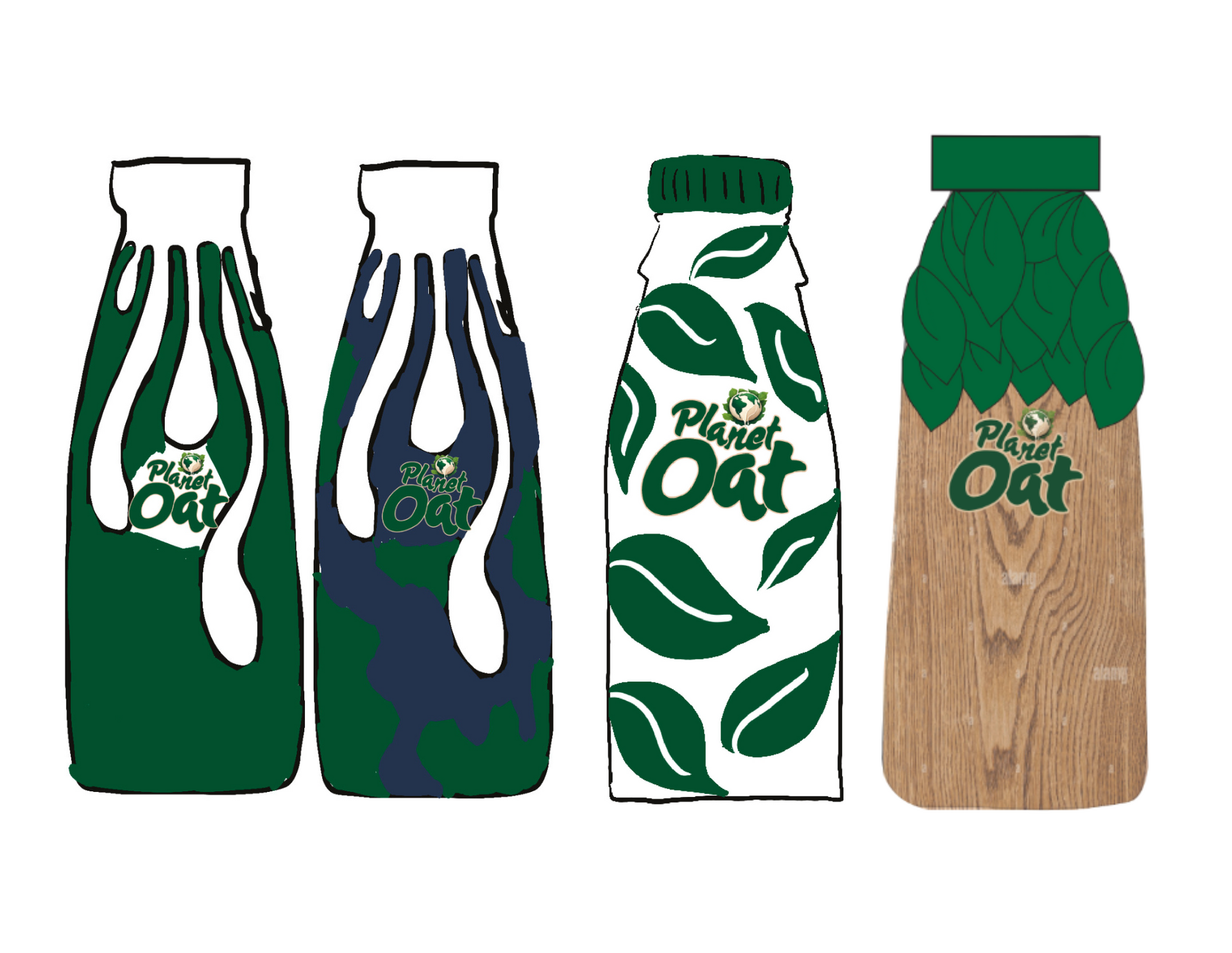
Hatching the concept
Drips, leaves, or what if I made the whole bottle a tree?
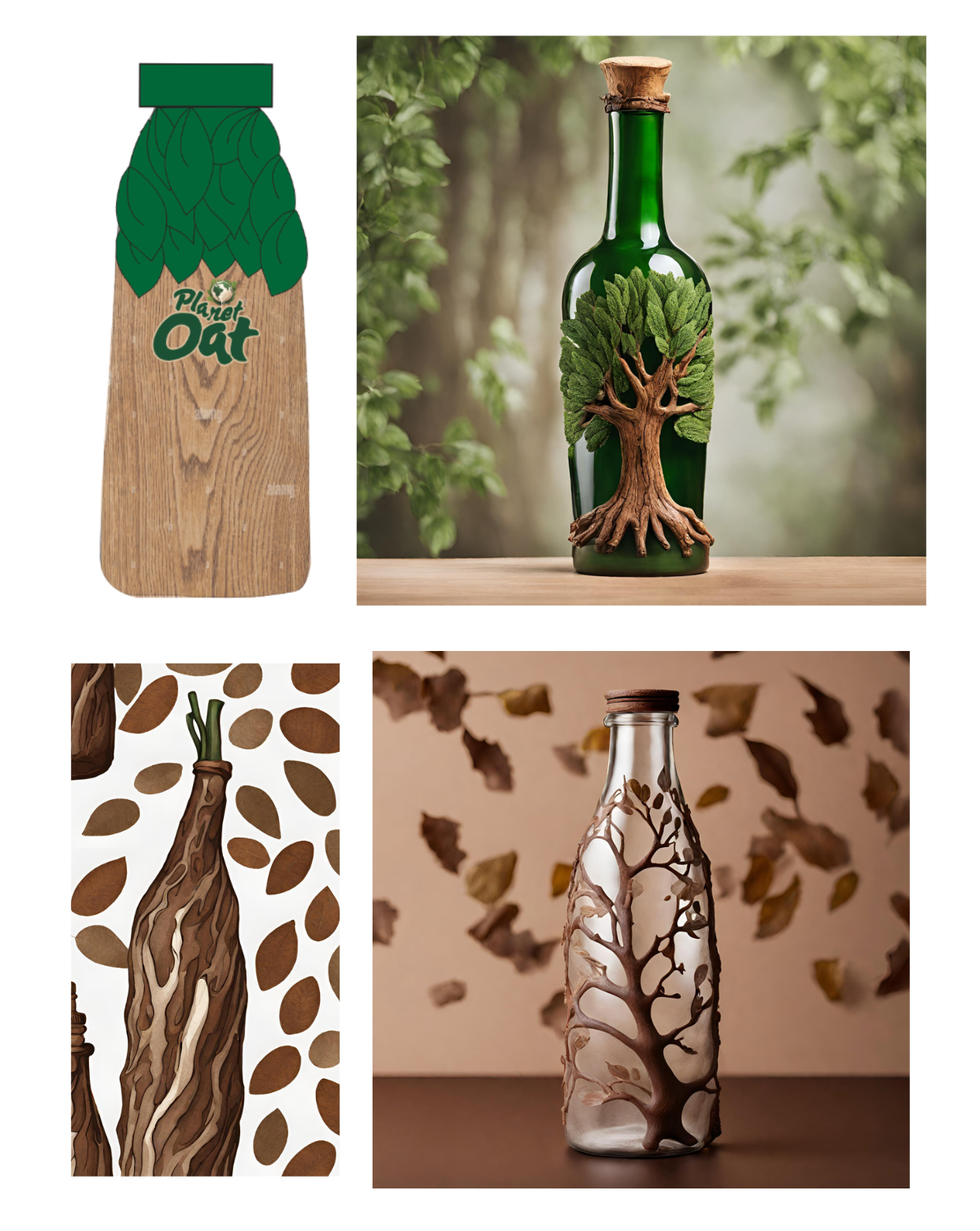
Take AI out for drinks
Can AI elevate the idea floating
around in my head?
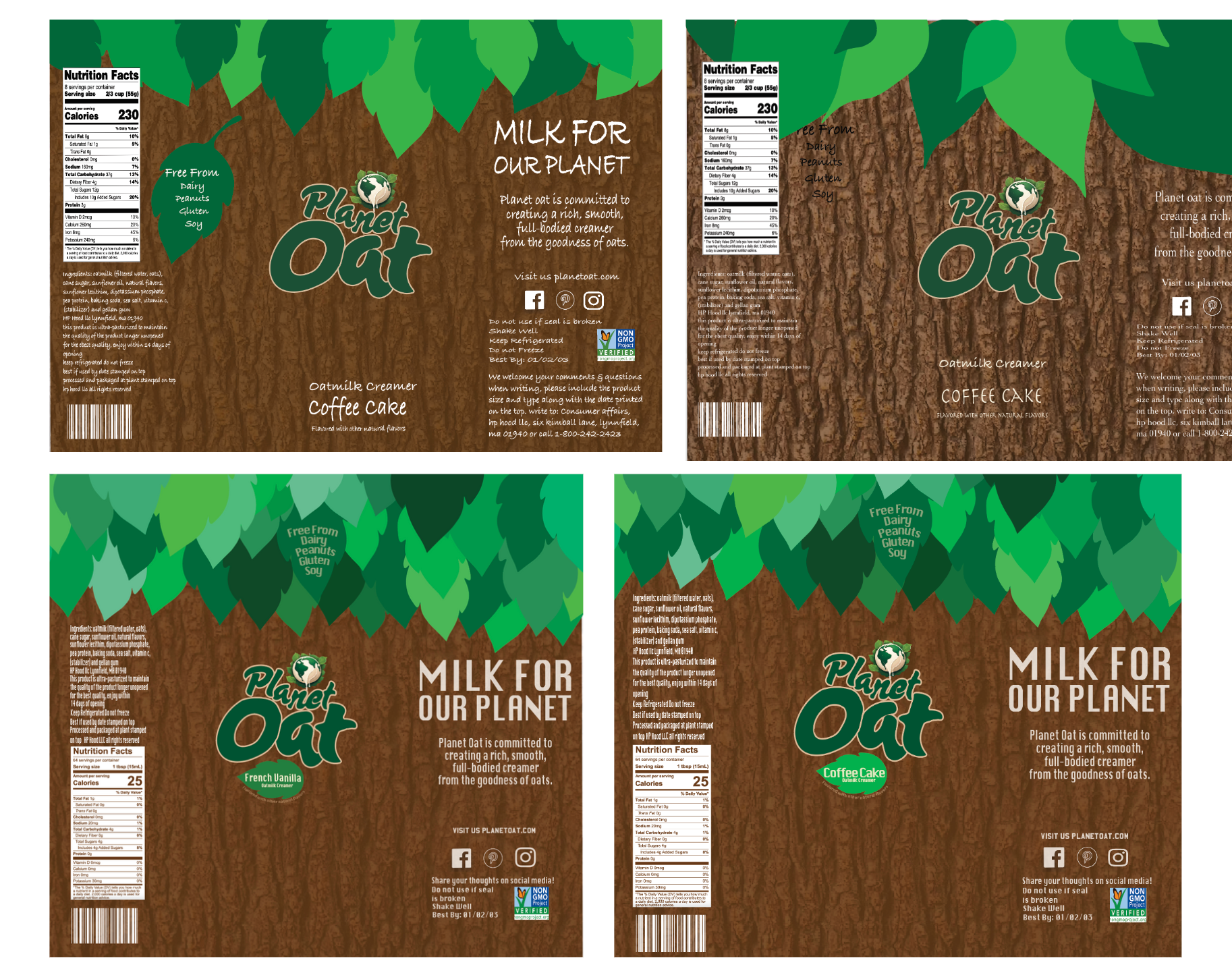
Persevere til perfection
Small changes can make a big difference.
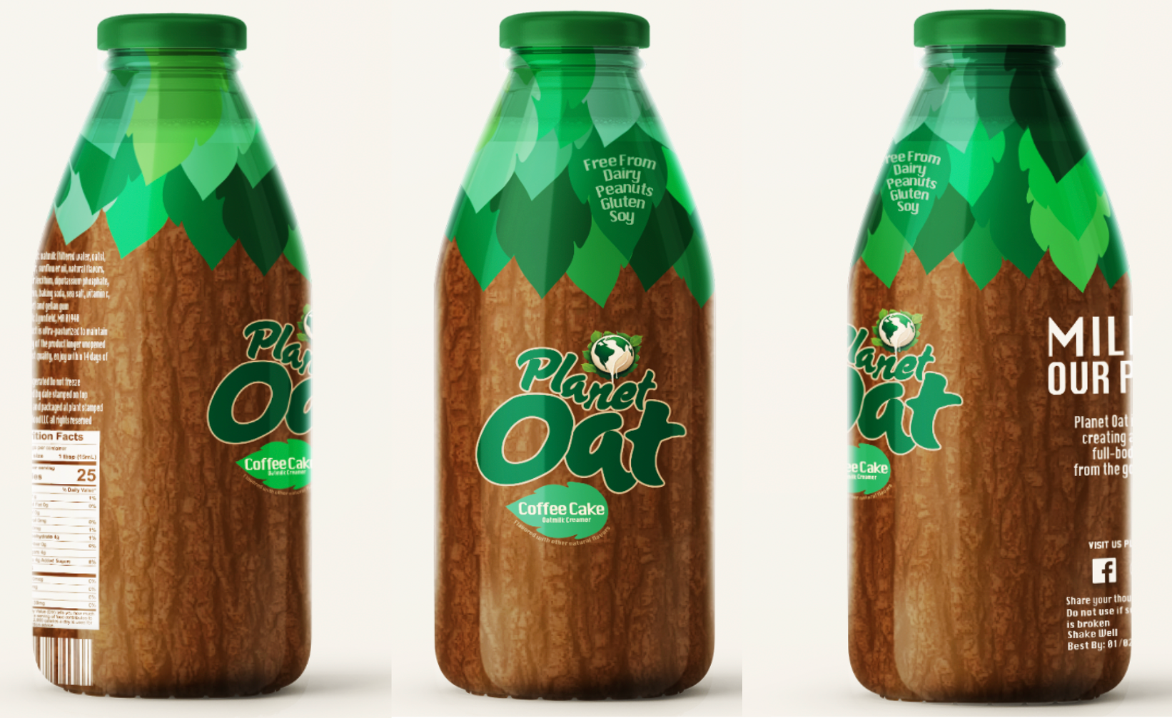
No more boring plastic bottles
Switching to glass bottles to highlight sustainability of oat milk.
The Final Package Design
Designed to remind consumers oat milk comes from nature.
